For my first act of the year, I am announcing the start of a new blog series: Ugly Data. The Ugly Data series is going to show you how NOT to do data analysis.
Intentional or not, people make very significant errors when conducting analysis of some data. The results of these errors can be minimal or they could be far-reaching.
The series is motivated by posts made by other Redditors on r/dataisugly.
What is wrong with this chart?
For example, what is wrong with this chart showing the average height of women across a select list of countries?
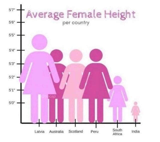
At first glance, everything just seems wrong.
- Indian women could not possibly be this short in comparison to women from other countries.
- And, why are Latvian women so big? I thought we were only comparing heights.
A Redditor, u/Entire-Database1679, said "Evidently females get significantly wider as they get taller."
The answer is scale
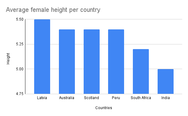
Specifically, the scale on the y-axis does not start from 0. For illustration, take a look at the reconstructed chart below.
While the intention might have been to "zoom in" on the relative differences in average height, the result of such action greatly misrepresents the actual situation. At best, the graph would seem "off" to readers and at worst, some readers will assume that "all" Indian women are shorter and smaller than Latvian women.
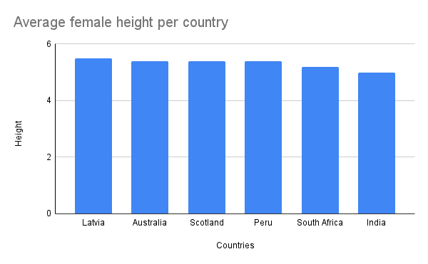
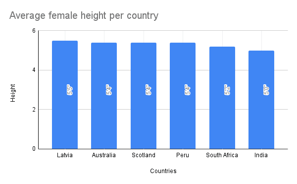
Now that we can see exactly what was wrong with the original chart, we can improve it. After correcting the scale as shown above, the information contained in the chart can be displayed better by adding labels.
In summary
- The original chart, for reasons best known to the analyst, was not properly scaled. When we change the scale to start from 0, we can see that the differences in average height of women from different countries are not so significant.
- With the use of labels, readers and viewers of the chart are also well informed of the exact height of each bar.
Reposted from my old blog.